
Sports Philanthropy Network.org –
Visual Systems & Graphics Design
Agency: Sports Philanthropy Network | my role: Visual Designer / Media Systems Designer
Overview
The Sports Philanthropy Network (SPN) is a U.S.-based nonprofit leveraging sports to build stronger, healthier, and more inclusive communities. With conferences, webinars, podcasts, and national events like Super Bowl Radio Row, SPN produces a high volume of digital media — but lacked a unified visual system across touchpoints.
My role was to design and systematize visual assets across:
-
Webinar broadcasts
-
Leadership Cabinet media
-
Podcast new season rebrand
-
Super Bowl 59 & 60 Radio Row frames
-
Email signature system
-
Guest invitation graphics
-
Zoom / Streamyard backgrounds
-
Intro / Outro animations

The goal: Move from fragmented graphics to a scalable, recognizable visual system.
The Problem
SPN’s digital media presence was growing quickly:
-
Weekly webinars
-
Podcast new season launch
-
Super Bowl 59 & 60 interviews
-
Leadership Cabinet promotions
-
Social media announcements
-
Guest invitations
-
Email communications
However:
-
No unified frame system for video
-
Inconsistent typography and layout
-
Visual redundancy across graphics
-
No modular structure for reuse
-
Limited brand differentiation from prior seasons
Additionally, video content was being shared externally (LinkedIn, X, Instagram) without consistent branding — reducing visibility and attribution.
Objectives
1. Create reusable broadcast templates
2. Introduce a stronger visual hierarchy
3. Develop a scalable graphic system
4. Improve brand recognition across distributed media
5. Maintain nonprofit credibility while elevating production quality
Process
1. Audit & Brand Review
I reviewed:
• Existing podcast graphics
• Zoom backgrounds
• Webinar recordings
• Guest social media posts
• Prior Super Bowl video assets
• Website styling and brand palette
The review surfaced:
• Overuse of gradients without hierarchy
• Inconsistent logo placement
• No persistent footer system
• No unified broadcast frame
• Repeated visual patterns without refinement
I documented these findings and proposed a modular design system built on:
• 8-point spacing grid
• Shield logo as primary brand mark
• Red/black dynamic motion curves
• High-contrast overlays for video readability
• Text graphic footer system
2. Video Template System
A. Webinar Template Deliverables:
• Framed webinar layout
• Logo placement standards (shield version)
• Reusable text footer module
• Zoom-compatible background version
• Streamyard-compatible background version

The finalized video
B. Leadership Cabinet Template Scope included:
• Extracting individual introduction clips
• Creating modular intro snippets
• Designing shareable leadership graphics
• Building Instagram-ready visual versions
• Creating consistent upper header bar:“Sports Philanthropy Network Leadership Cabinet”

The finalized video
3. Super Bowl 59 & 60 – Radio Row Frame System
SPN interviews athletes, executives, and nonprofit leaders at Radio Row.

Solution:
A high-contrast red/black broadcast frame system with:
• Embedded video window
• Shield logo lockup
• Event identification (Super Bowl LX)
• Persistent brand footer
• Balanced motion curves inspired by new season graphics


This frame system:
• Standardized all Radio Row footage
• Increased brand visibility on reposts
• Elevated production value
4. Podcast Season 7 Visual Refresh
I evolved prior season styling into a stronger visual identity:
I evolved prior season styling into a stronger visual identity:
• Bolder typography
• Dynamic motion curve overlays
• Improved contrast and readability
• Guest logo placement refinement
• Modular 1:1 and 16:9 variations

The system allowed:
• Rapid guest graphic creation
• Social-ready square assets
• Episode number modularization
• Headshot + logo pairing consistency

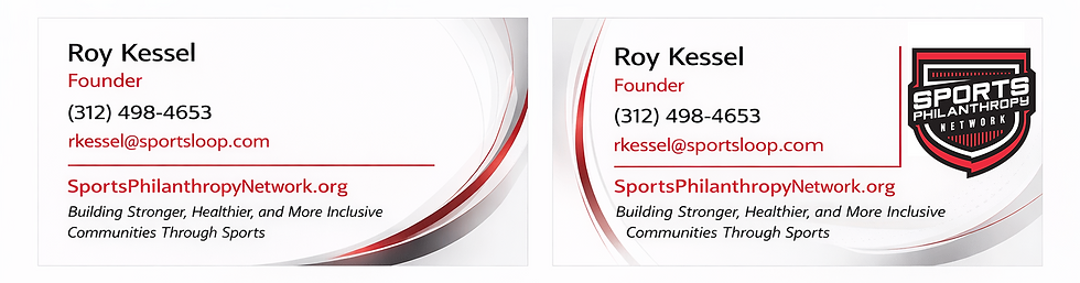
5. Signature Block Redesign
I evolved prior season styling into a stronger visual identity:
SPN requested a more modern, visually distinct email signature.
Goals:
• Replace previous generic layout
• Use shield logo
• Add subtle dynamic accents
• Maintain nonprofit professionalism
Multiple layout concepts were developed before refining into a final sleek version.
Systems Thinking
Rather than designing isolated graphics, I built:
Modular Components:
• Logo placement standards
• Text footer modules
• Red curve motion overlays
• Upper header bar variant
• Video mask structure
• Background texture set
Platform Adaptations:
• Zoom backgrounds
• Streamyard layouts
• Webinar frames
• Instagram graphics
• Email signature blocks
• Podcast cover art
• 30s / 60s video frames
Results
• Unified visual identity across SPN digital media
• Increased brand consistency in distributed video content
• Faster production time for new guest graphics
• Elevated perception of professionalism
• Established reusable template library
The visual system now supports:
• Webinars
• Leadership Cabinet content
• Podcast episodes
• Super Bowl Radio Row coverage
• Social media distribution
• Internal communications
Key Skills Demonstrated:
• Broadcast graphic systems design
• Modular template creation
• Brand evolution within constraints
• Video frame composition
• Social-first graphic optimization
• Cross-platform adaptation
• Nonprofit brand stewardship
• Stakeholder feedback integration
Reflection
This project required balancing:
• Production speed
• Nonprofit budget constraints
• Brand continuity
• Multi-platform outputs
• Leadership feedback loops
Rather than reinventing the brand, I strengthened it by introducing:
• Hierarchy
• Consistency
• Scalability
• Visual rhythm
The result was a cohesive broadcast-ready visual ecosystem — one that positions SPN’s media presence with greater authority and recognition.